Marist University · Team Project · 2025
Wooly's Dining Option
UX & Menu Designer · team of six
Design Objective
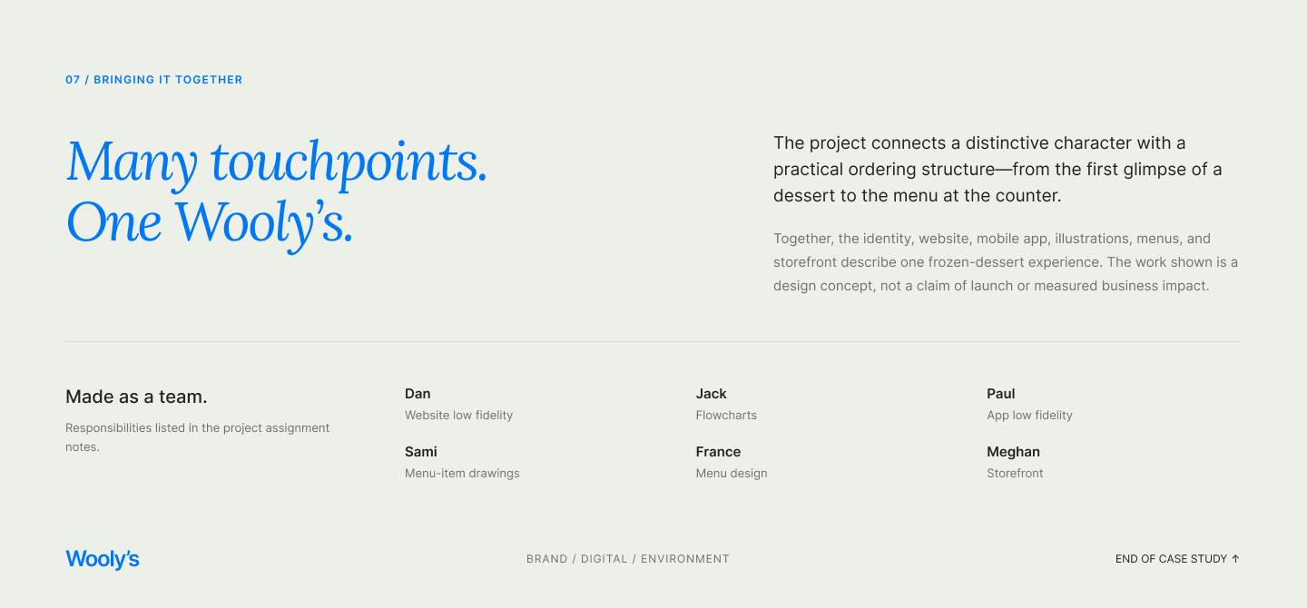
Wooly's is a concept frozen-dessert shop for the Marist campus, designed as a collaborative team project. The case study runs from research to high fidelity: student and faculty personas, an identity exploration that trades an early yeti for a mischievous blue mammoth, flowcharts and low-fidelity wireframes, and a finished desktop website and mobile ordering app — then carries the same blue-led identity into menus, illustrated desserts, and a storefront counter concept.
Figma, Illustrator
Projects
- People & Context
- Finding the Character
- From Flow to Interface
- The Desktop Experience
- The Mobile Ordering Experience
- Beyond the Screen
- The Menu Design
- Bringing It Together
People & Context
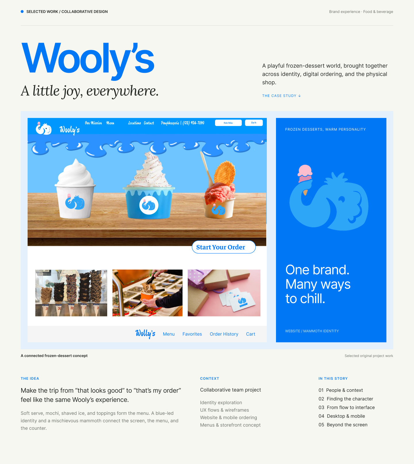
The research framing: two supplied personas — a full-time student on foot with a $10–20 meal budget, and a commuting faculty member who enjoys sharing a treat — each paired with the design question they raise. The case study follows three practical considerations: make the range easy to scan, give customization a clear place, and keep pickup information close to the order.
Open the Figma file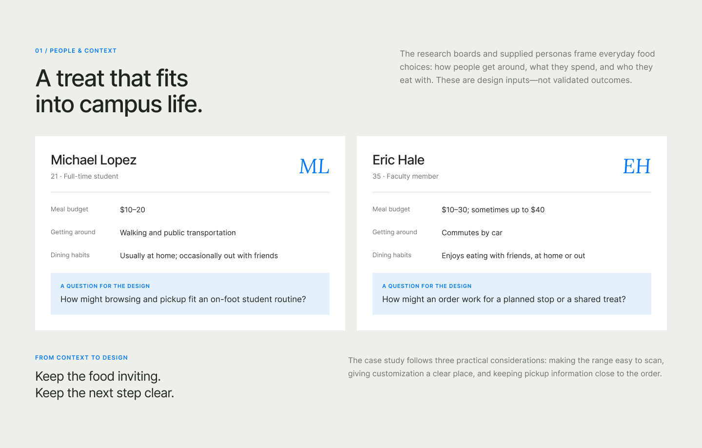
Finding the Character
The identity exploration: an early yeti direction tested the cold-dessert idea on a campus-poster concept, before the later mammoth identity gave Wooly's a softer, more playful face — bright blue, rounded shapes, and a small pink scoop, with the mammoth's lifted trunk turning an ice-cream cone into the defining brand gesture.
From Flow to Interface
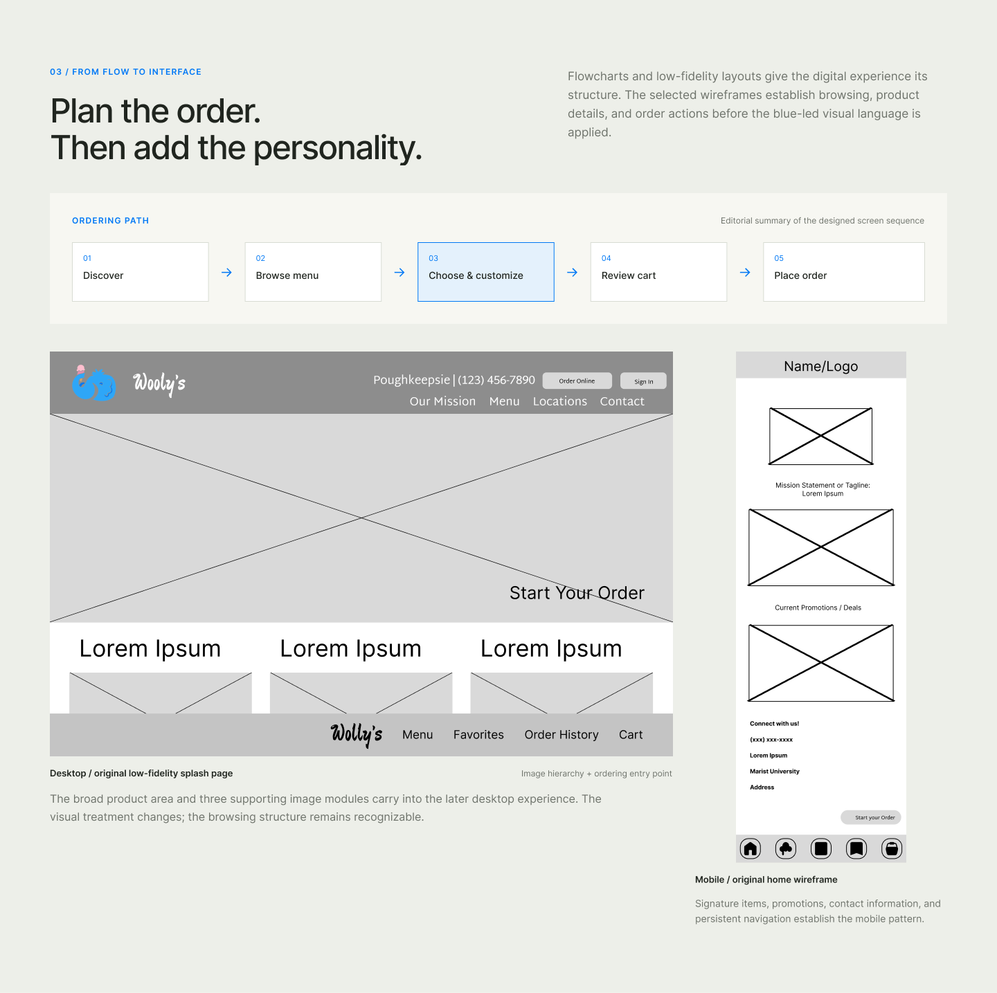
Flowcharts and low-fidelity layouts give the digital experience its structure before the visual language is applied: a five-step ordering path from Discover to Place order, a desktop low-fidelity splash page whose browsing structure carries into the final site, and a mobile home wireframe establishing signature items, promotions, and persistent navigation.
The Desktop Experience
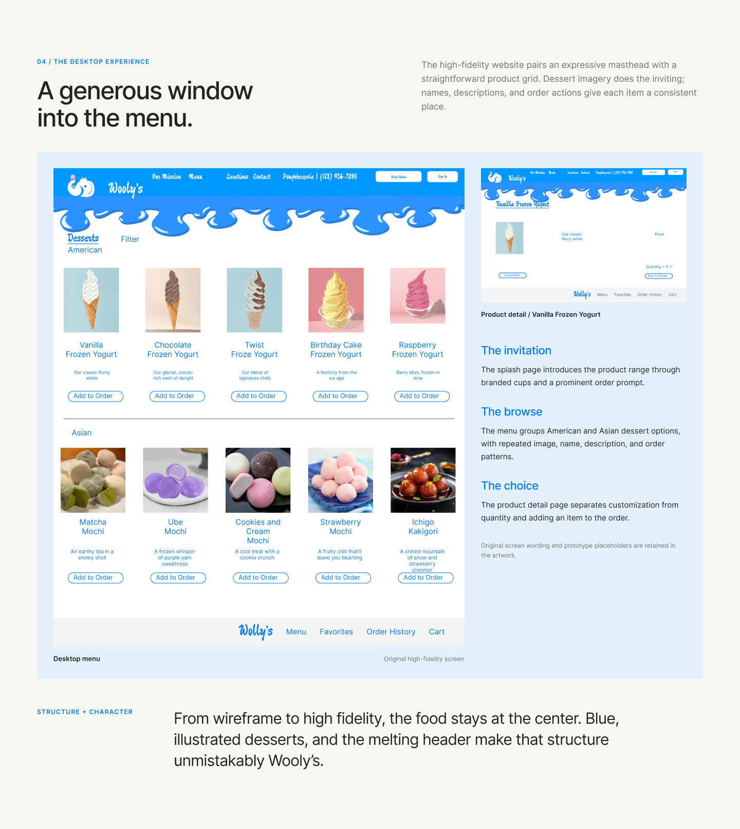
The high-fidelity website pairs an expressive melting masthead with a straightforward product grid: dessert imagery does the inviting, while names, descriptions, and order actions give each item a consistent place. The menu groups American and Asian dessert options, and the product detail page separates customization from quantity and adding to the order.
The Mobile Ordering Experience
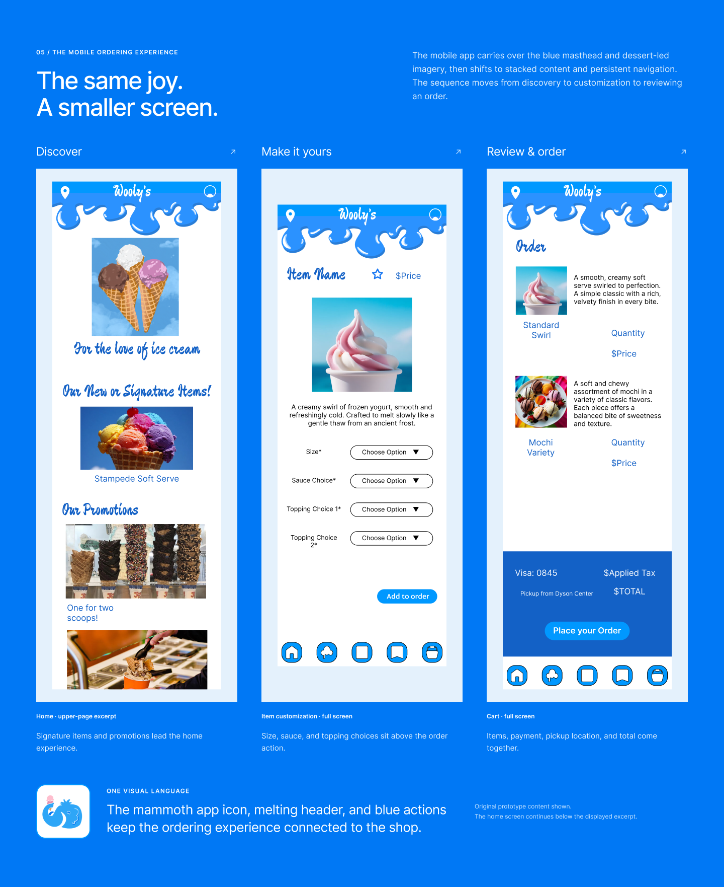
The mobile app carries over the blue masthead and dessert-led imagery, then shifts to stacked content and persistent navigation. The sequence moves from discovery — signature items and promotions leading the home experience — through item customization with size, sauce, and topping choices, to a cart that brings items, payment, pickup location, and total together.
Beyond the Screen
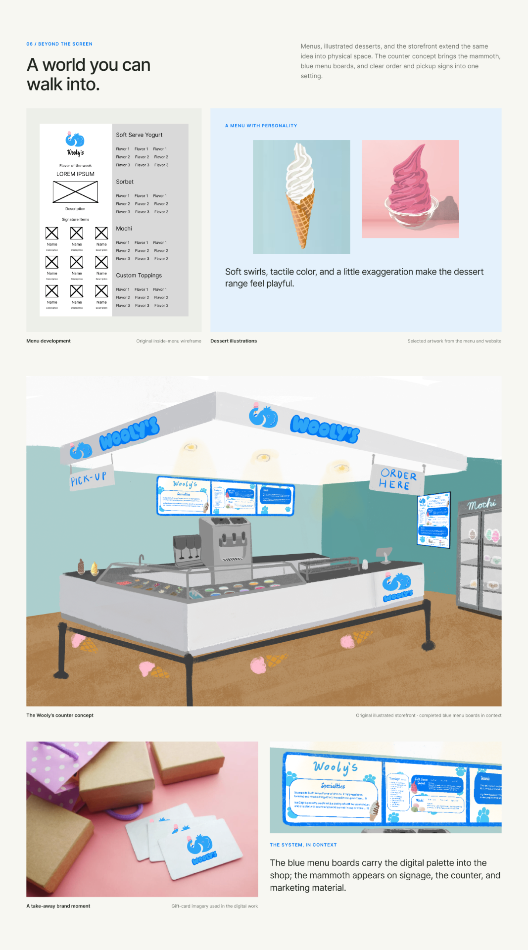
Menus, illustrated desserts, and the storefront extend the same idea into physical space: an inside-menu wireframe, soft-swirl dessert illustrations with tactile color, and the Wooly's counter concept — blue menu boards, clear order and pickup signs, and the mammoth on signage, the counter, gift cards, and marketing material.
The Menu Design
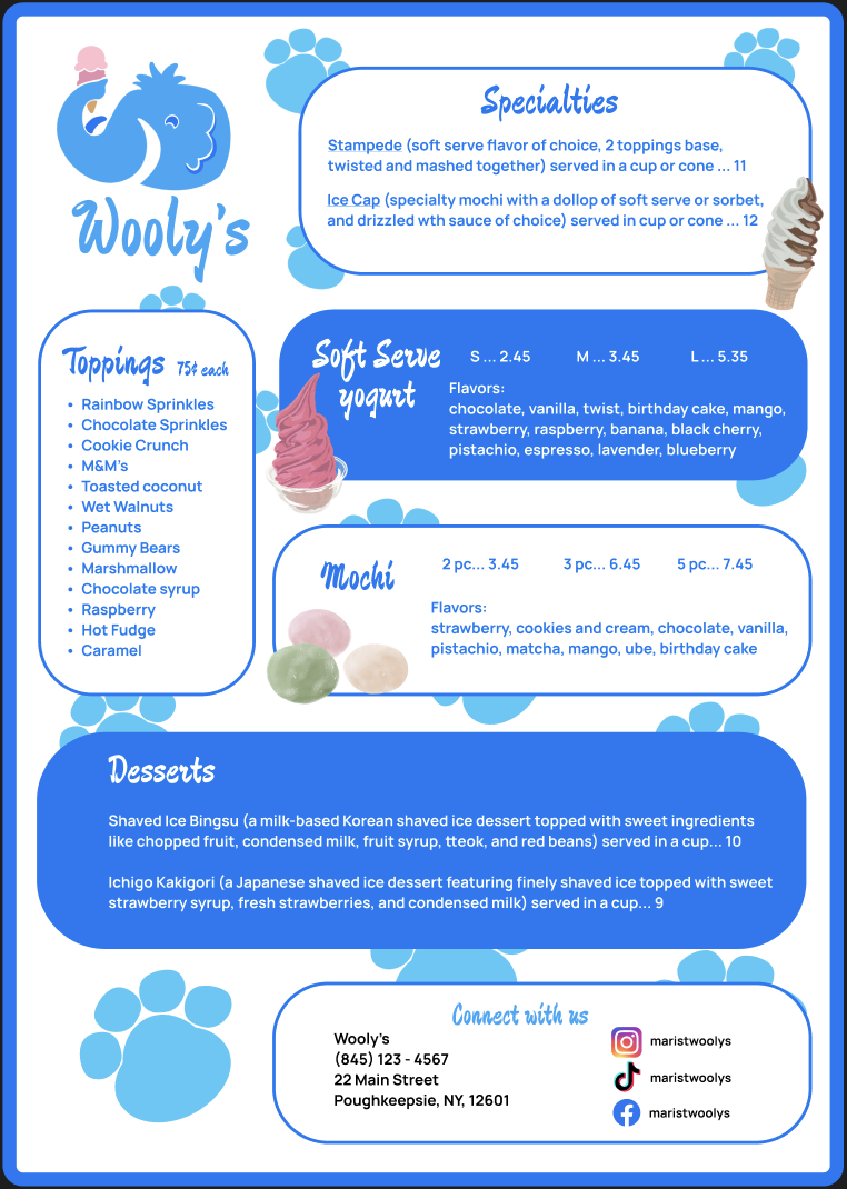
The printed menu brings the identity onto the counter: paw prints and illustrated soft serve, mochi, and a cone carry the mammoth's bright-blue world across Specialty items, a toppings list, size and flavor pricing, and the shaved-ice desserts — closing with the shop's address and socials in a rounded card, so the whole page reads as one friendly piece.
Bringing It Together
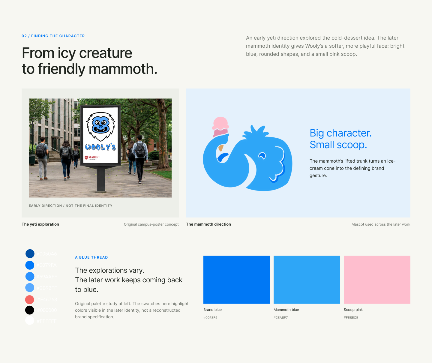
One Wooly's across many touchpoints: the identity, website, mobile app, illustrations, menus, and storefront describe a single frozen-dessert experience. Made as a team of six — with responsibilities spanning website low fidelity, flowcharts, app low fidelity, menu-item drawings, menu design, and the storefront.